The 7-Eleven logo is among the most recognizable brand symbols on the planet. Its distinctive combination of red, orange, and green can be seen on storefronts in countless countries, making it a familiar landmark in busy cities, suburban neighborhoods, and highway rest stops around the world.
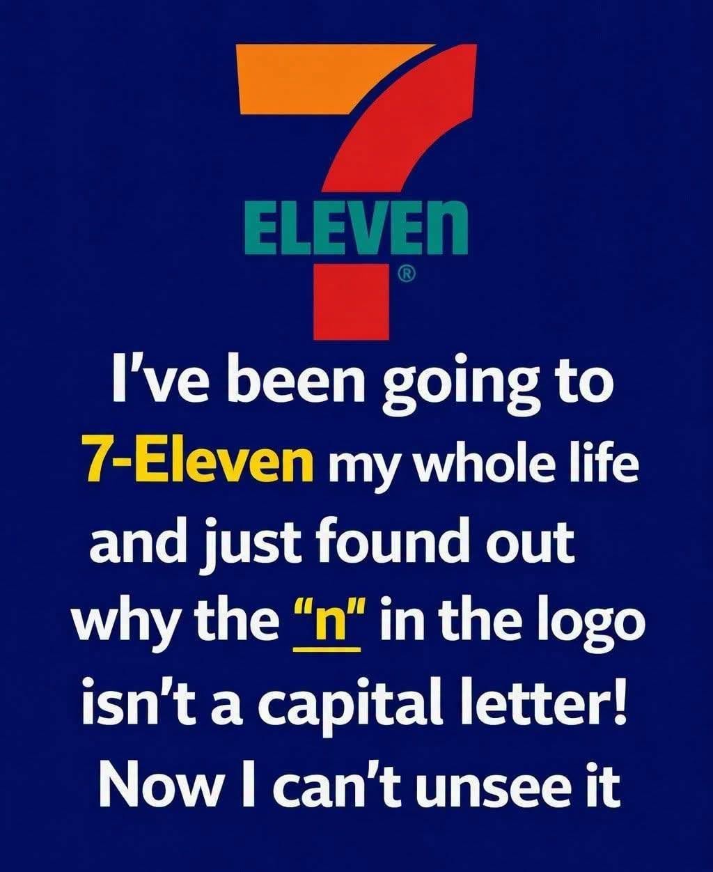
At first glance, the design appears simple and straightforward. Most people recognize the large number “7” and the word “Eleven” without giving the logo a second thought. Yet those who take a closer look often notice a curious detail hidden in plain sight. While nearly every letter in the word appears in uppercase style, the final letter—the “n” in “Eleven”—is noticeably lowercase.
For many observers, this small inconsistency sparks immediate curiosity. Some assume it must be a printing mistake, while others wonder if it contains a secret meaning known only to company insiders. In reality, the lowercase “n” was a completely intentional design choice, one that has remained part of the company’s visual identity for decades and carries an interesting story about branding, psychology, and corporate evolution.
To understand how this unusual detail came to exist, it helps to look back at the origins of the company itself and the journey that transformed it from a small local business into a globally recognized convenience store giant.
The story begins in 1927 in Dallas, Texas, where the business operated under a very different name: Tote’m Stores. At the time, the concept behind the company was considered innovative. Rather than requiring customers to visit multiple specialty shops for everyday necessities, these stores offered a variety of common household items in a single convenient location.
The name “Tote’m” reflected the idea that customers could conveniently tote, or carry, their groceries and daily essentials from one place. Products such as bread, milk, eggs, and other necessities were available together, creating a more efficient shopping experience during a period when retail was often fragmented and less convenient.
From the beginning, the company built its reputation around accessibility and practicality. Customers appreciated being able to complete routine purchases quickly, and this commitment to convenience would eventually become the foundation of the brand’s global success.
A major turning point arrived in 1946 when the company decided to rebrand. Executives wanted a name that reflected one of their most significant competitive advantages: extended operating hours. At a time when most stores closed relatively early, these locations remained open from 7 a.m. until 11 p.m.
This schedule was considered remarkably convenient for the era, giving customers access to products long after many competing businesses had shut their doors for the evening. To highlight this advantage, the company adopted a new name that directly referenced its operating hours: 7-Eleven.
The name immediately communicated convenience, flexibility, and reliability. Customers knew they could count on the stores when other options were unavailable. Over time, the name became synonymous with accessibility and customer service, helping the company establish a distinct identity within the retail industry.
With the new name in place, the company needed a visual identity that would be memorable and instantly recognizable. Designers developed a logo centered around the prominent number “7,” making it the focal point of the brand. The word “Eleven” was incorporated beneath or alongside the numeral, creating a clean and straightforward design that reinforced the company’s name.
Color selection played an equally important role. The combination of red, orange, and green was chosen because it stood out dramatically against most backgrounds. Whether displayed on a busy city street or along a remote highway, the sign was designed to catch attention immediately.
This emphasis on visibility proved highly effective. Drivers, pedestrians, and travelers could identify a 7-Eleven location from a distance, which was particularly valuable for a business model built around quick stops and spontaneous purchases. As the company expanded, maintaining this visual consistency helped establish powerful brand recognition across different regions and countries.
Although many people today associate 7-Eleven with 24-hour operation, that feature did not exist from the beginning. The shift toward around-the-clock service emerged gradually during the early 1960s. One often-cited example occurred in Austin, Texas, during a busy football weekend when customer demand remained unusually high late into the evening.
In response, a local store decided to stay open beyond its normal hours. The decision proved highly successful. Customers appreciated the additional convenience, and sales increased significantly. Encouraged by the positive response, other locations began experimenting with longer operating schedules.
Eventually, many stores adopted full 24-hour service, transforming 7-Eleven into one of the pioneers of round-the-clock retail. Despite this significant operational change, the company retained its original name. By then, “7-Eleven” had become a powerful brand with tremendous recognition and value, making a name change unnecessary.
Yet among all the features of the logo, the most fascinating detail remains the lowercase “n” at the end of “Eleven.”
According to company history, earlier versions of the logo reportedly displayed all the letters in uppercase form. While the design was bold and highly visible, some believed it appeared overly rigid and somewhat harsh. It projected strength but lacked warmth and approachability.
The inspiration for the change reportedly came from an unexpected source. The wife of then-company president Joe C. Thompson Jr. suggested replacing the final capital “N” with a lowercase letter. Her reasoning was simple: the adjustment would soften the appearance of the logo and make it feel more welcoming to customers.
Though the modification was incredibly small, its effect was surprisingly significant. The mixed-case lettering created a friendlier visual impression while preserving the logo’s strong identity. The design became more balanced and approachable without sacrificing readability or recognition.
Importantly, the lowercase “n” was not intended to symbolize anything hidden or mysterious. It was not a code, a secret message, or a marketing gimmick. It was simply a thoughtful design decision aimed at improving the emotional tone of the brand.
What makes this detail so remarkable is how effectively such a subtle change can influence perception. In branding and typography, even the smallest adjustments can affect how people interpret a company’s personality. Fully capitalized text often appears more authoritative and formal, while mixed-case lettering tends to feel friendlier and more human.
For 7-Eleven, the lowercase “n” helped create a balance between strength and accessibility. It softened the logo’s appearance while maintaining the bold visual impact necessary for a highly visible retail brand. Over time, this tiny design choice became an inseparable part of the company’s identity.
Throughout the decades, the logo has undergone minor refinements and modernization efforts. However, its core elements have remained remarkably consistent. The iconic “7,” the vibrant color palette, and the distinctive typography continue to define the brand around the world.
This consistency has been one of the company’s greatest branding strengths. Customers instantly recognize the logo regardless of location, language, or culture. Whether someone encounters a store in North America, Asia, Europe, or elsewhere, the familiar design communicates the same promise of convenience and accessibility.
Today, the 7-Eleven logo represents far more than a chain of convenience stores. It symbolizes decades of business growth, thoughtful branding decisions, and a commitment to meeting everyday customer needs. Every aspect of the design—from the colors to the typography—reflects the company’s effort to create a recognizable and approachable identity.
Even the smallest detail, the lowercase “n,” demonstrates how powerful subtle design choices can be. What appears insignificant at first glance has helped shape the visual personality of one of the world’s most successful retail brands.
The story behind the logo serves as a reminder that effective branding is often built through careful refinement rather than dramatic transformation. Sometimes the smallest adjustments leave the most lasting impressions.
From its beginnings as Tote’m Stores in Texas to its rise as a global convenience icon, 7-Eleven has consistently focused on simplicity, practicality, and customer convenience. The famous lowercase “n” remains a quiet but enduring symbol of that philosophy—a tiny design element that continues to capture attention and spark curiosity generations after it was first introduced.