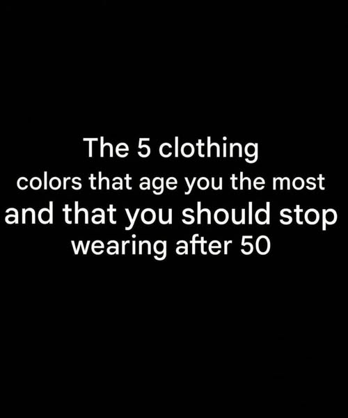
Have you ever caught your reflection unexpectedly and felt that quiet jolt of confusion? The blouse still fits the way it always has. Your hairstyle hasn’t dramatically changed. You slept reasonably well. And yet something feels different. Your face looks more tired than you actually feel. The skin under your eyes seems darker. Your complexion appears flatter somehow, less alive. There’s a dullness you can’t quite identify — not dramatic enough to name, but noticeable enough to unsettle you. It’s tempting to blame age. Or exhaustion. Or stress. But often, it isn’t any of those. It’s the silent influence of color.
That unsettling mirror moment is rarely about “looking older.” More often, it’s about contrast quietly shifting as your skin evolves. After 50, natural pigmentation softens. The sharp contrast that once defined your features — darker brows against brighter skin, rosier undertones, stronger definition around the eyes and lips — gradually becomes more delicate. When that happens, certain colors that once looked striking can begin to overpower you. Deep black, for example, which may have once framed your face beautifully, can now cast subtle shadows upward. Very dark navy can emphasize under-eye circles. Harsh charcoal can flatten your natural warmth. These shades don’t suddenly become “wrong,” but their placement becomes more important.
Wearing black close to your face can carve out shadows you don’t need. Moving it downward — into skirts, trousers, or shoes — instantly softens its impact. If you love black (and many of us do), pairing it with pearls, soft gold jewelry, cream scarves, or a warmer-toned neckline creates a buffer between the darkness and your skin. That small adjustment can brighten your entire appearance without changing your personal style. Even makeup can work in harmony here: a touch of cream blush, a slightly richer lip color, a softly defined brow. These additions don’t mask age — they restore balance.
On the other end of the spectrum, overly pale pastels and muted neutrals can quietly drain you. Baby pink, powder blue, beige, and dusty taupe may feel gentle and safe, but when they closely match the lightness of your skin, they can blur your features instead of enhancing them. The result isn’t dramatic — it’s subtle fading. The solution isn’t abandoning softness, but choosing clearer, slightly deeper tones. Raspberry instead of pale pink. Sky blue instead of baby blue. Fresh sage or vibrant green instead of muddy khaki. These colors reflect light back onto your face rather than absorbing it. They create definition without harshness.
What’s really happening isn’t decline — it’s evolution. Your coloring is shifting, and your wardrobe may simply need to shift with it. The goal isn’t to give up the shades you’ve always loved or to chase trends that don’t feel authentic. It’s about placement, depth, and harmony. When color supports your complexion instead of competing with it, something remarkable happens: your skin appears brighter, your eyes clearer, your overall presence more energized. You don’t look “younger.” You look more alive.
And perhaps most importantly, you stop disappearing into your clothes. You stop mistaking shadow for aging. You start recognizing that radiance isn’t about turning back time — it’s about working with who you are now. When your palette evolves alongside you, the mirror stops surprising you. Instead, it reflects someone fully seen, softly luminous, and unmistakably herself.