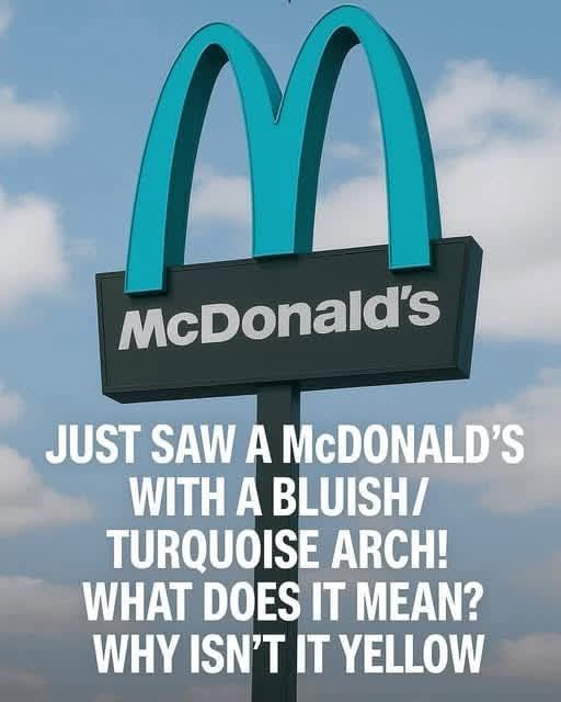
Deep within the high desert of the American Southwest, among the towering red rock formations and the famously mystical landscape of Sedona, Arizona, sits a global anomaly that quietly defies decades of corporate branding. To most travelers, a McDonald’s is instantly recognizable—a familiar structure marked by bright golden arches standing against the ordinary backdrop of highways and parking lots. Yet in this particular place, that global uniformity breaks completely. The iconic “M” is not gold at all, but a soft turquoise, making it the only McDonald’s in the world to abandon its signature color in favor of a hue that blends with the desert sky and landscape.
This unusual design choice is not an accident, nor a faded relic of experimentation. It is the result of a long-standing agreement between a multinational corporation and a community determined to preserve its visual identity. Sedona is widely known not only for its dramatic scenery but also for its strong commitment to protecting the natural beauty that defines it. In this town, the environment is treated as something more than a backdrop—it is considered part of the town’s cultural and spiritual identity. Because of this, when McDonald’s planned to open a location there in the early 1990s, the proposal was met with concern rather than excitement.
At the time, Sedona already enforced strict regulations on architecture, signage, and color usage. These rules were designed to ensure that any man-made structure would harmonize with the surrounding desert tones—deep reds, burnt oranges, and earthy browns. City planners argued that the standard bright yellow arches would visually clash with the natural landscape and disrupt the aesthetic balance that made Sedona unique. Their position was clear: commercial development was welcome, but only if it respected the character of the environment.
The negotiations that followed between the city and McDonald’s became an unusual case of corporate adaptation. McDonald’s is famously protective of its brand identity, particularly its visual elements, which are standardized across the world. However, in this instance, the company agreed to compromise. Instead of the traditional golden yellow, the arches would be redesigned in a muted turquoise tone that better matched the desert sky and regional artistic influences. The intention was not to stand out, but to blend in.
When the restaurant finally opened, the result was unexpectedly the opposite of what anyone had predicted. Although the design was meant to be subtle and unobtrusive, the turquoise arches immediately captured public attention. What was intended as a quiet integration into the landscape became a global curiosity. Visitors passing through Sedona quickly began seeking out the location, turning it into an unofficial landmark. Tourists hiking nearby trails or exploring the town’s scenic viewpoints often added a stop at the turquoise McDonald’s simply to witness its unusual design in person.
Over time, the location evolved from a local fast-food restaurant into a widely recognized attraction. In the age of social media, its uniqueness only amplified its fame. Photos of the turquoise arches set against the red rock desert spread rapidly online, turning the restaurant into a symbolic intersection of corporate identity and local preservation. Ironically, a design meant to reduce visual impact ended up increasing visibility on a global scale.
Beyond its aesthetic appeal, the Sedona McDonald’s has come to represent a broader idea about the relationship between global brands and local communities. It demonstrates that large corporations can adapt to regional values without losing their core identity. In this case, the compromise did not weaken the brand—it reshaped it in a way that made it more memorable. The restaurant remains unmistakably McDonald’s in function and purpose, yet visually it reflects the environment in which it exists.
The turquoise arches also highlight Sedona’s broader commitment to preserving its unique character. In a world where many towns and cities are increasingly visually uniform, Sedona stands out for its insistence on maintaining harmony between development and nature. The McDonald’s location has become a small but powerful example of how design regulations can shape not only individual buildings but also the identity of an entire place.
Today, the Sedona McDonald’s continues to serve both locals and visitors, functioning as both a restaurant and an unofficial landmark. People come for the food, but many stay for the experience of seeing a global icon transformed by its surroundings. The turquoise arches against the backdrop of red desert cliffs create a contrast that feels almost symbolic—modern commerce meeting ancient landscape, global branding meeting local preservation.
In the end, this single location demonstrates that even the most standardized global systems are capable of adaptation. The Sedona McDonald’s is not just a curiosity; it is a reminder that identity is not fixed, even for multinational corporations. When placed within a strong sense of place, even something as rigid as a global brand can change color—and in doing so, become something entirely new while still remaining itself.