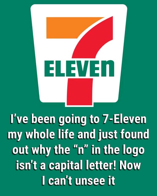
Convenience feels ordinary—until you notice the glitch, that tiny detail that somehow refuses to blend into the background. You’ve passed the glowing 7‑Eleven sign countless times, maybe without thinking twice, but one day your attention locks on it. Something is off. Something subtle, almost imperceptible, yet unmistakably present. That last “n” in “Eleven” is lowercase. It stands out. It feels wrong. It feels deliberate. It’s the kind of small oddity that makes your brain pause, makes you question: was this a mistake? Did nobody notice? Or did someone choose it that way, for a reason you can’t yet see? And the longer you look, the more it lodges in your mind, a tiny puzzle you can’t quite ignore.
Most people speed past that sign every single day without a second thought, never questioning the font, the colors, or the spacing. But once your eyes catch that lowercase “n,” it starts to nag at you, a quiet irritation mixed with curiosity. And yet, despite the attention it commands, it isn’t a typo, nor is it some hidden code or subliminal message. It is, in fact, the outcome of a single suggestion, a small human choice that softened the face of an entire brand. When the company transitioned from Tote’m Stores to the now-iconic 7‑Eleven, it adopted a bold, memorable logo in red, orange, and green, and the word “ELEVEN” was originally written entirely in capital letters. The all-caps design was strong, assertive, impossible to ignore—but it also felt harsh, cold, and almost intimidating in its rigidity. Something about it lacked warmth.
According to the company’s own lore, the president’s wife offered a simple yet transformative idea: make the last “N” lowercase. It was a subtle tweak, a barely noticeable adjustment, but one designed to make the logo feel friendlier, more approachable, and less like a shout in neon. That tiny suggestion stuck. And decades later, the odd little “n” continues to soften the heavy “7” above it, subtly transforming the way people experience the word. It makes the brand approachable, human, and memorable in a way that the bold letters alone never could. A single, carefully considered letter changed the perception of a store sign forever, proving that even in the world of corporate design, small gestures can ripple outward in ways no one could have predicted.
Next time you walk past a 7‑Eleven, pause for a moment. Notice the quirk. Appreciate the detail. That lowercase “n” isn’t just a letter—it’s a tiny act of human intuition, a reminder that design isn’t only about visibility or impact, but about emotion, connection, and the subtle ways small choices can shape our experience of the everyday world. A single lowercase letter, unnoticed by millions, quietly turned a practical convenience store into a cultural icon, demonstrating that sometimes the smallest gestures leave the biggest marks.